CSS Framework
To establish a unified style language throughout Alliance Auth and Community Apps, Alliance Auth is providing its own CSS framework with a couple of CSS classes.
Cursors
Our CSS framework provides different classes to manipulate the cursor, which are missing in Bootstrap.
CSS Class |
Effect |
Example |
|---|---|---|
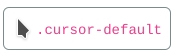
cursor-default |
System default curser |
|
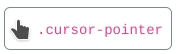
cursor-pointer |
Pointer, like it looks like for links and form buttons |
|
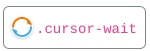
cursor-wait |
Wait animation |
|
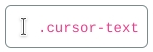
cursor-text |
Text selection cursor |
|
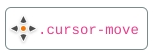
cursor-move |
4-arrow-shaped cursor |
|
cursor-help |
Cursor with a little question mark |

|
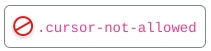
cursor-not-allowed |
Not Allowed sign |
|
cursor-inherit |
Inherited from its parent element |
|
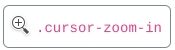
cursor-zoom-in |
Zoom in symbol |
|
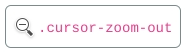
cursor-zoom-out |
Zoom out symbol |
|
Callout-Boxes
These are similar to the Bootstrap alert/notification boxes, but not as “loud”.
Callout-boxes need a base-class (.aa-callout) and a modifier-class (e.g.:
.aa-callout-info for an info-box). Modifier classes are available for the usual
Bootstrap alert levels “Success”, “Info”, “Warning” and “Danger”.
HTML
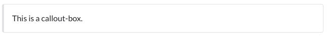
<div class="aa-callout">
    <p>
      This is a callout-box.
    </p>
</div>
Alert Level Modifier Classes
The callout boxes come in four alert levels: success, info, warning and danger.
Use the modifier classes .aa-callout-success, .aa-callout-info, .aa-callout-warning and .aa-callout-danger to change the left border color of the callout box.
<div class="aa-callout aa-callout-success">
    <p>
        This is a success callout-box.
    </p>
</div>

<div class="aa-callout aa-callout-info">
    <p>
        This is an info callout-box.
    </p>
</div>

<div class="aa-callout aa-callout-warning">
    <p>
        This is a warning callout-box.
    </p>
</div>

<div class="aa-callout aa-callout-danger">
    <p>
        This is a danger callout-box.
    </p>
</div>

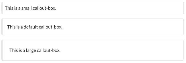
Size Modifier Classes
The callout boxes come in three sizes: small, default and large.
Use the modifier classes .aa-callout-sm for small and .aa-callout-lg for large, where .aa-callout-sm will change the default padding form 1rem to 0.5rem and .aa-callout-lg will change it to 1.5rem.
These modifier classes can be combined with the alert level modifier classes.
<div class="aa-callout aa-callout-sm">
    <p>
        This is a small callout-box.
    </p>
</div>

<div class="aa-callout">
    <p>
        This is a default callout-box.
    </p>
</div>

<div class="aa-callout aa-callout-lg">
    <p>
        This is a large callout-box.
    </p>
</div>